|
<< back
| ||
|
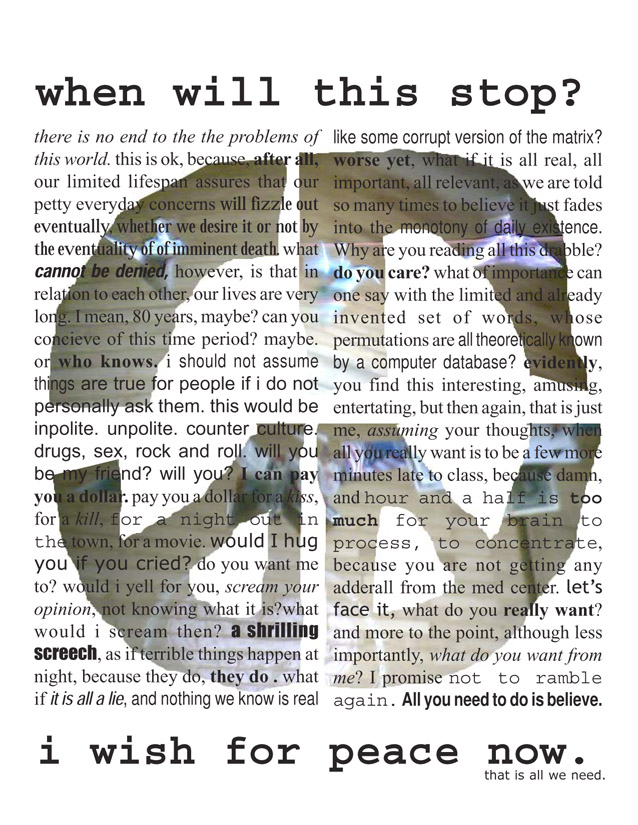
MARIANA BACA The idea behind this poster was to start from a stream of consciousness. Rambling about random ideas of what people find important in their lives, what one wants from daily human interaction, seemed like the way to break free from this repeated pattern of template posters. The text itself makes little cohesive sense, and the text is cropped on the sides, even if solitary expressions ring true to certain people, giving the sense of the confusion which makes peace hard to attain. At the same time, the convolutions of the text give a feeling of vertigo to the reader. However, on the top and the bottom of the massive block of text is a simple, bold-face message, underlines the main message. The scattering of random typefaces and styles of text was intended to both highlight sections of the text, with the intent that different words would jump out at certain people, partly because of the content, partly because of the character of the font. The concept behind this sequence of pictures is to unify many symbols of peace through their coming together. The first picture is of one of those origami swans. I found the purple color of the origami hanging on the string against the bland background particularly stunning. I moved the camera backwards as the picture was recording to give the impression of the bird moving towards accomplishing some goal. The idea behind it was to convey the feeling of peace needing to be sought after if one really wants it. The bottom image brings more symbols into the picture. It brings symbols like an American flag and money hanging from the wires. The image I thought of then I saw this was of topping the good feelings associated with peace with a capitalist approach to peace, such as a prospering economy. Peace brings good things, regardless of one's motivations sometimes. | |
| | ||
|
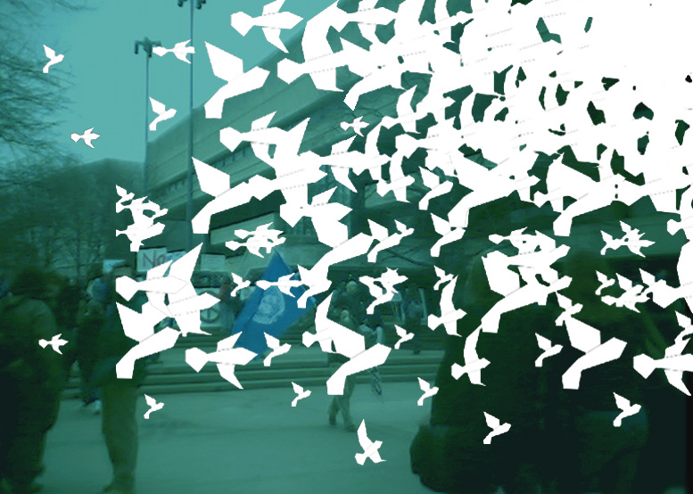
ANNIE DING This piece evolved from an assignment to make a peace poster using only the word peace for text and tries to evoke a sense of how simple the idea of peace is in contrast to how difficult it is to attain. The doves are meant to make the text appear subtly in the negative space, while simple geometric shapes are contrasted against the background photograph of MIT students in protest against the war. The light and shadows projected from the layers of doves show some breaking free and flying off the page. | |
| | ||
|
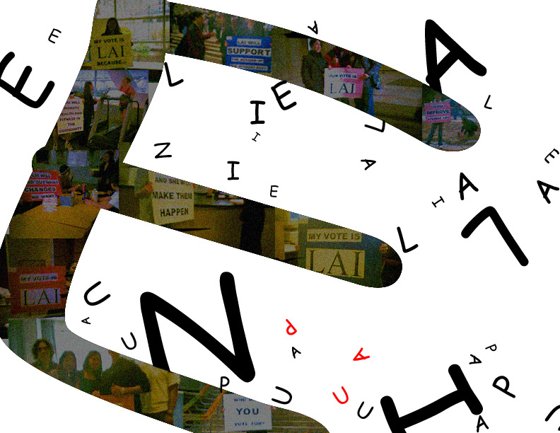
ELAINE LAI "Elaine for UAP". The message I am trying to communicate in this piece is, "Vote for Elaine for UAP (Undergraduate Association President)". I wanted to create a campaign poster that was eye-catching, something that would stand out in the midst of posters on a wall. The message is hidden but if you look closely, the letters of my name grow larger, as if they are coming out of the page. The collage within the large "E" are images from my image campaign sequence. The letters U, A, and P appear in red, as a contrast to the other letters on the page. The audience's eyes initially fall randomly on the page but are eventually drawn to the letters UAP. My goals were to create a piece that was visually appealing, interesting, and also conveyed a message with a little effort from the audience. | |
| | ||
|
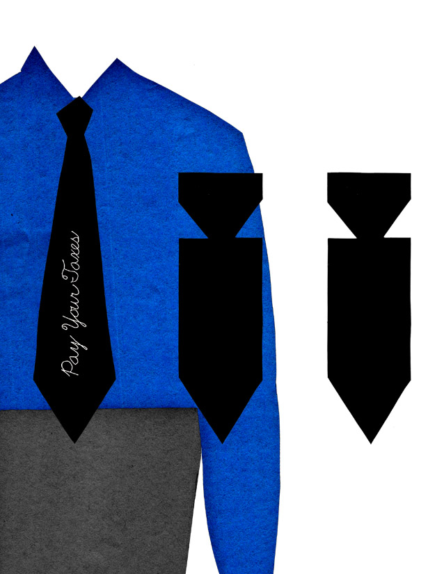
QUINN MAHONEY This piece is a visual representation of the link between work and war. The two symbols chosen for this poster, the tie and the bombs, already have connotations associated with them. The tie indicates the distress of the disenchanted worker, while the bombs signify the physical distress of warfare. The decorative text, also the title of the poster, dispels any ambiguity about the combination of these two images and the missing head of the cubicle-dweller. The innocent-looking paper cutouts and hand-written lettering only enhance the sarcasm of the message. The blue shirt was not meant to represent the blue-collar worker, but interpretation is open to the viewer. | |
| | ||
|
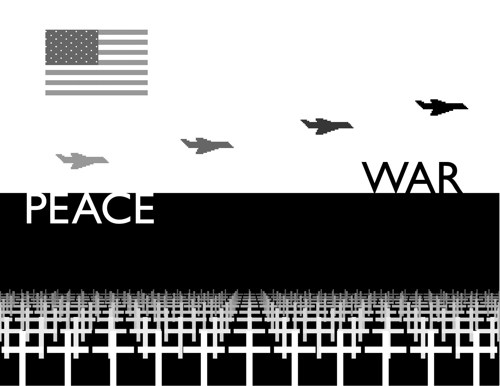
DAVID MELLIS For my DBN animation in support of peace, I needed a concept which would come across in a 101x101-pixel grayscale setting. The image of a graveyard, depicted as receding rows of crosses is legible at low resolution and without color. At the same time, it points out the most direct and damaging cost of war: human death. The regular rows of crosses suggest Arlington National Cemetery, the resting place of many of America's most honored military casualties. My DBN piece in support of war was under similar technical constraints. The American flag retains its impact even without color or resolution high enough to draw actual stars. In addition to the flag, I included a fighter plane zooming across the bottom of the applet. Planes often appear in pro-war posters, probably because of all the vast arsenal of the U.S. military, they are most removed from the immediacy and horror of combat. Even in battle, fighters retain grace and a lightness derived from their airy surroundings. | |
| | ||
|
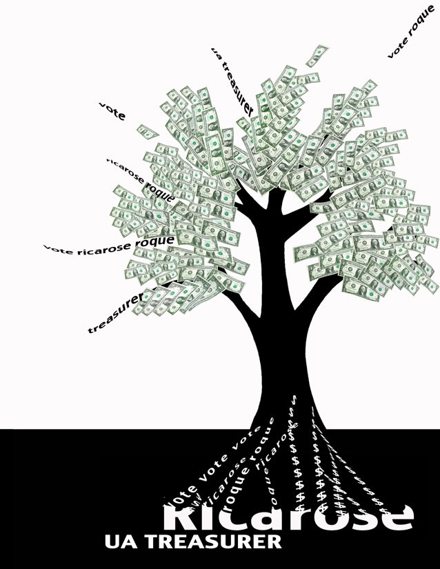
RICAROSE ROQUE In running in our pseudo UA-campaign, I wanted to entice people with money. I wanted to build greedy excitement in people when they saw this money tree in it's abundance and freshness. I delved into this UA project first thinking about how people would benefit if they voted for me. And it came down to this: If you vote for me, money will grow organically and continue on as long as you support me. | |
| | ||
|
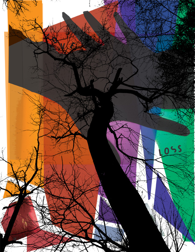
JESSICA ROSENKRANTZ "Transfiguration" is an adaptation of my work for a mas110 assignment: tell a love story through ten silhouettes. Here the 10 images are distilled to 2, a new level of simplicity. But little more is required to make the archetype clear. Love and loss is perhaps one of the most fundamental dialectics. Stand straight in front of the 2 layers to step out of narrative scope, away from the linear pattern of events. Can the two concepts be separated? Here we perceive them as inextricably linked. Step between the layers to consider each stage separately. Love: Two people come together, hands join, transfigured in a new light. The man is red, the female blue but their union is more than the sum of their essences; it is something new, a spectrum. The elements of the assemblage mirror the idea of union. Disparate pieces, colors, textures become one, a vibrant whole. But the lower portion suggests an opposing connotation: are they coming together or being cut apart? Turn around, face the other composition. Loss: View the world through the barren forms of the naked trees. Lonely figures, dead yet suggestive of some prior vibrancy and perhaps a latent life. Rebirth, love springs, turn around and repeat. etc. | |
| | ||
|
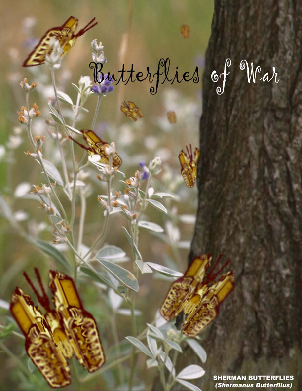
MANDY SMITH Butterflies of War is a commentary on the absurdity of war. The text is intended to confuse the viewer; butterflies and wars are two entities that are not commonly associated with one anther. My hope is that the viewer will recognize the disconnect in the text and take a closer look at the picture for an explanation. Upon closer inspection of the image, the viewer will see that butterflies are composed of tanks. The text at the bottom of the poster, "Sherman Butterflies" should also hint at the fact these butterflies are, in fact, Sherman tanks. The point of making butterflies out of tanks is to emphasize the point that wars are not found in nature. Only humans fight wars. It seems ludicrous to have butterflies fighting wars with other butterflies; hopefully, the viewers will extend this thought and conclude that it is also ridiculous for humans to fight wars against other humans. | |
| | ||
|
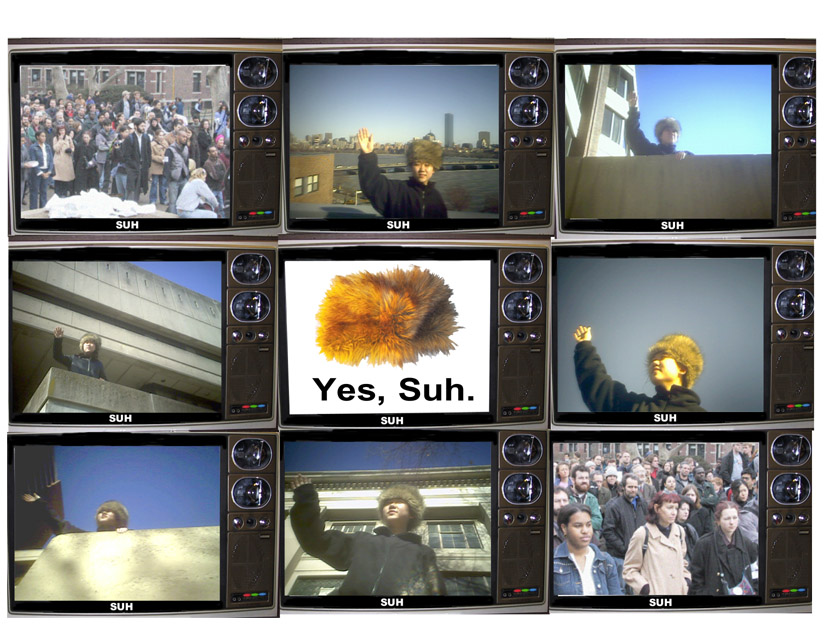
ALICE SUH "The Suh State". In this piece, I attempted to make the analogy between the social oppressiveness of the Stalinist authoritarian state, and the intellectual oppressiveness of MIT. All of the pictures were taken on the MIT campus and are meant to recall old Stalinist propaganda. I found the fur hat was a simple yet powerful way to evoke the feeling of an authoritarian communist state. The two pictures, at the upper left and lower right corners, are of crowds of MIT students ("the masses") and are meant to frame the work. | |
| | ||
|
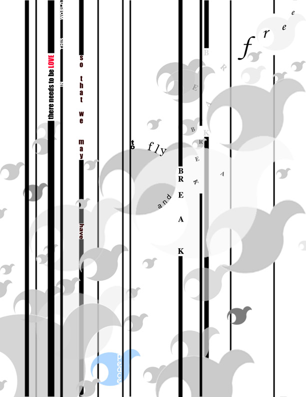
RAN TAO at first it was just one. and then they multiplied. thrown across the page in a series of shapes yearning to escape. but it was not easy. the obstacles they encountered were great and challenging. what do you feel. what do you see. can you be like them. can you b r e a k f r e e.... i created the image as a response to the feelings and emotions that i felt regarding the previous peace assignments. it represents the constraints that i know show up in everyday life and the motivation that needs to exist to overcome those constraints. | |
| | ||
|
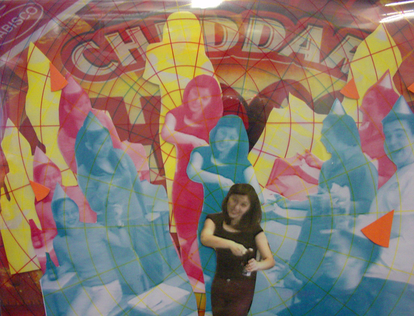
AILEEN WU Question: How do you add excitement to an action-packed color photo promoting Aileen's mock campaign for UA Social Chair? Answer: Layers, gridlines, party hat enhancements, color and a box of Cheese Nips. This piece is my tribute to Andy Warhol, Mentos commercials, cheesy snack foods from all over the world and the ancient art of Oriental paper cutting. | |